
Harmony: Workjam's design system
Entrusting designers and developers with Harmony
Expertise
Platforms
Deliverables
Website
Visit website
Overview
Embarking on a design odyssey: Creating Harmony from complexity
Meet Harmony, a remarkable design system brought to life to help designers and developers collaborate seamlessly. This magical system reduces hand-off time and integration hassles, fostering unity and efficiency.
Nurturing expertise: Forging the path with product design
As a Product Designer, I delved into the realm of design systems. Our goal? We aimed to create a robust set of rules and guidelines that would serve as the bedrock for our products across various platforms, from the web to iOS and Android.

Execution
Unveiling the vision: Tackling design challenges head-on
Picture a screen cluttered with menus, where finding the right component feels like a quest. We all know that frustration! I saw this, felt it, and decided it was time for a change. With screen resolutions limiting the experience, I envisioned a design system that would be both sophisticated and inclusive.
Bringing order to chaos: Executing the Design System
We established core principles to guide our design system:
Unified & Universal: Consistency and accessibility were our guiding lights. Our design language would resonate across devices, apps, and users, ensuring seamless experiences.
Useful & Efficient: Our system prioritized utility over showmanship. We streamlined core interactions, slashing unnecessary clicks and wasted space, making daily tasks efficient and valuable.
Empower Users: User-centricity drove us. We delved into research, empathized with users, and designed what they truly needed. The result? Designs that empowered, not overwhelmed.
Structuring the framework: Organization in Figma
I proposed a centralized hub for everything – components, documentation, specifications. Figma became our canvas. UX developers could view designs directly in Storybook and access attached documentation. We simplified by removing pixel specifications as components could be directly developed. To address doubts, clicking a component redirected to a dedicated library.

Tokens: Streamlining colours for clarity
We tackled colour redundancy head-on. By minimizing options, decisions became straightforward. A UI Designer meticulously reviewed colors via examples. Principal tokens emerged, cascading through various components in the app.


Results
Results: Elegance in action
Our design system was more than an abstract concept; it transformed into tangible components. Buttons, icons, and various UI elements were harmonized.
- Button Overview:
- Primary Buttons
- Secondary Buttons
- Tertiary Buttons
- Destructive Buttons

Secondary buttons

Tertiary buttons

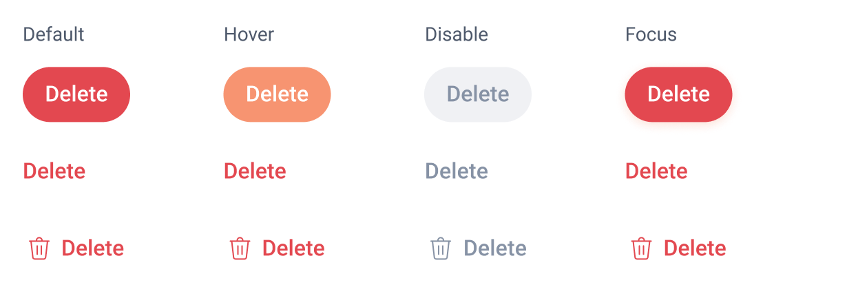
Destructive buttons
Documentation: A beacon of clarity
Button behaviour and usage were documented. Primary buttons stood alone, executing key actions like "Save" or "Publish." Secondary buttons supported primary ones, enabling actions like "Cancel" or "Draft."


Specs: The nitty-gritty details
We dived into the specifics, detailing font, colour, and container properties for primary and secondary buttons.

In essence, Harmony transformed Workjam's design landscape. Our design system wasn't just lines of code; it was a symphony that orchestrated seamless collaboration, enhancing our products' essence across platforms.