
Interactive timesheet management
Empowering frontline workers with better scheduling
Expertise
Platforms
Deliverables
Website
Visit website
Overview
Starting out facing challenges:
Imagine WorkJam, the tool that helps workers manage schedules, time off, and time cards. I jumped in as a Product Designer to make this process smoother and friendlier.

The Beginning addressing issues:
When I arrived, the app design was cluttered, not working well on different devices, and had confusing navigation. I talked with the Chief Product Officer and learned that understanding users, from small shops to big companies, was key.

Execution
The Vision: Discovering what's needed
Managing shifts for managers was tough. Figuring out who's unavailable, who wants to change shifts, and dealing with rules was a headache. Workers needed an easier way too. So, I imagined things visual, helping managers and workers quickly see what's happening.

Finding the Path: Learning from others and planning
I checked out similar apps and found cool features. I used these ideas to rearrange WorkJam, putting things where they make sense. For example, I combined availability info with scheduling.

Making a plan: Designing with purpose
I created stories about what users want. This helped guide my design and kept things focused on what users need.

Putting ideas into action: Designing and testing
I brainstormed with the team and turned ideas into sketches. Navigation got simpler, menus got better, and everything worked well.


Creating the look: Designing screens
I made detailed designs for how the app would look. Shift management got easier to understand and use.

Results
Seeing results: Making a difference
The changes were huge. Navigating the app got smoother, and managers got a better calendar view. This helped them assign shifts more accurately.
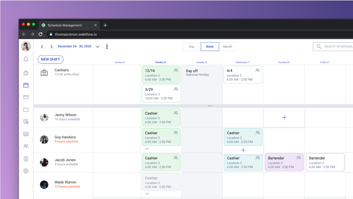
Showing information clearly: Visualizing data
Data became easier to understand with pictures. Daily views and drag-and-drop tools made managing shifts a breeze.

Week at a glance: Looking ahead
Weekly views made things even clearer. Plus, I had a cool idea using smart suggestions to pick the best workers for shifts based on their hours and skills.

In conclusion: Redefining design, improving WorkJam
This journey wasn’t just about changing the app; it was about making work life simpler. By listening to users, using creative ideas, and building tools that work, I helped make WorkJam a friendlier place for everyone.